Acadyr founders have an idea about developing a decentralized blockchain education app by making it accessible and understandable for people in Spanish.
Challenge
Create an MVP for a disruptive blockchain education platform in one month.
My role
- UX researcher
- Interaction Designer.
- Visual Designer
Exploring the users’ problems
We decide to answer these three questions
- For who is the product?
- How could this idea help them?
- What could top features make them accomplish their goals?
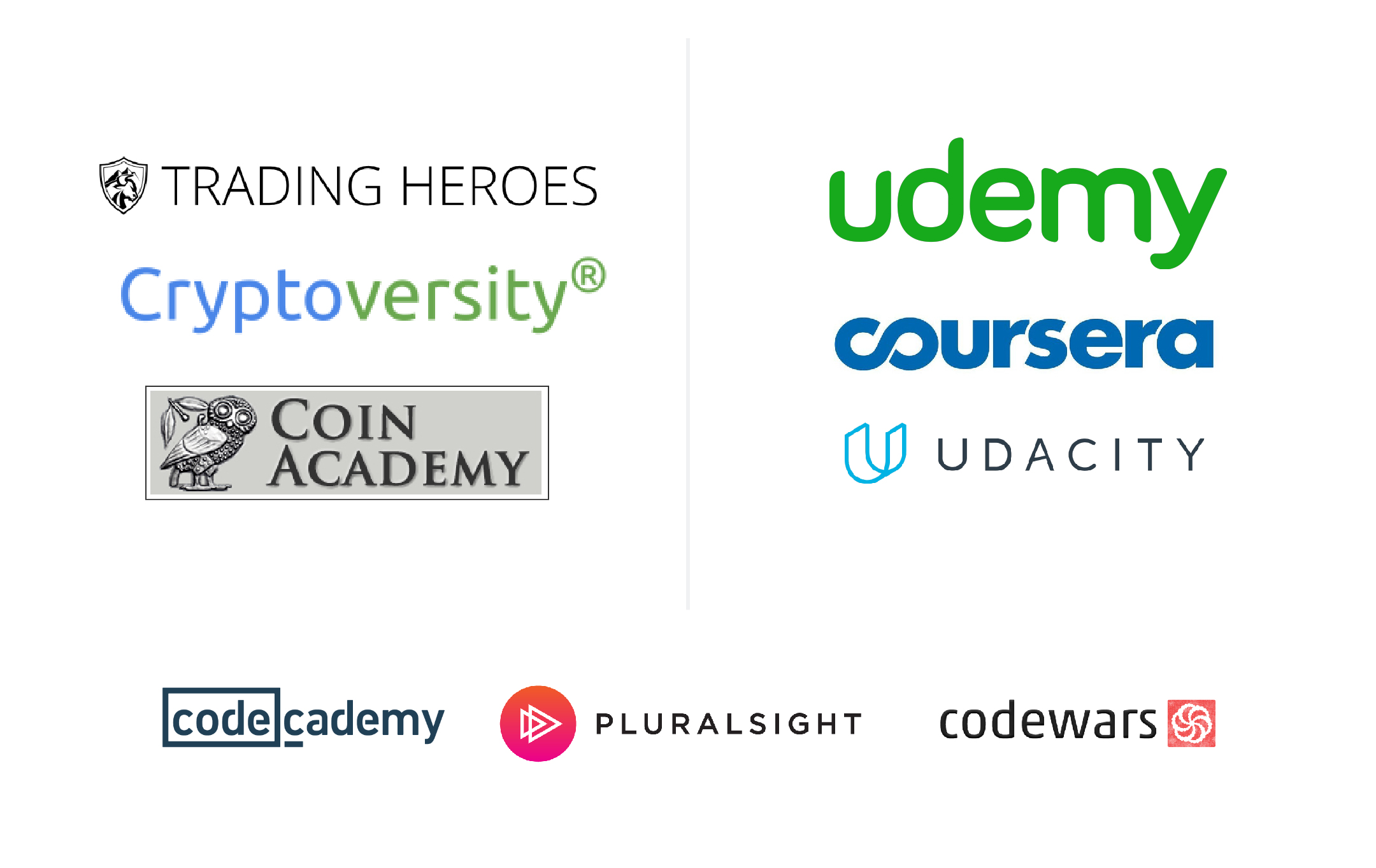
I Analyze the TOP Learning Management Systems (LMS) in the market and compare them to Crypto Education Platforms (CEP) to gain some good practices that were already working for the industry. Look for patterns and observe critical features across all to gain insights that could be helpful for the project.
Results
The main objectives I identify while researching platforms:
- Course Retention: The use of features to maintain retention is a crucial objective through these platforms. We needed the user to finish every lesson.
- Sense of Progress: students needed a way to verify they were learning and feeling they were moving forward.
- Rewards: Platforms use rewards or gamification as a way for students to keep engaged and learning.
Key features
- Videos were short enough to maintain attention throughout the course and motivate the students to the next chapter.
- It is helpful to have a preview of the course content before taking it.
- Chapters navigation menu inside the lessons was a great tool to navigate and create a sense of advance.
- Course dashboard was necessary to check for progress
- Winning medals on chapters end was a reward to keep learning.

User People
I researched cryptocurrency forums and education platforms to understand our top users, their pains, goals, and thoughts about crypto education. Once finished, I defined two users, Lucia and Alberto.
Lucia
It is difficult for her to start with this new technology because there is little information about it. She looks for online courses but didn’t found too much. Therefore, she has not decided to buy any cryptocurrency yet.
Alberto
As a developer, Alberto has extensive knowledge of programming. Some of his developers’ friends mentioned Bitcoin and the blockchain to him, so he decided to watch some videos on YouTube that explained the crypto world, but it was not enough, he would like to find a platform to guide him step-by-step through an easy-to-understand path with explanations that go straight to the point.
These archetypes helped us define the tone of communication on the platform and possible ways to approach them both for usability testing and better understand their needs.
Exploring design solutions
User Journey
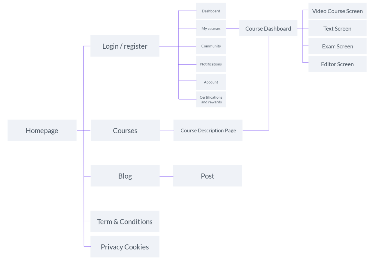
With the insights gathered from the last step, I create a user flow map for developers to start working as soon as possible.
The MVP flow will be:
- Course Page
The user will land on the course page, where there will be tabs for the Dashboard, the course syllabus, reviews, and teachers.
This page will have two variations: When someone is not in the course and wants to register and a second one when is enrolled. This last one will have course progress and essential information about the user.
- Register Page
Once the user clicks on «Start Now,» they will be redirected to a landing page with a registration form and a google single sign-on option.
- Lesson Page
After register, the user will be redirected to the Lesson page and could start learning!

Wireframes
I designed four layouts to choose the best option and asked 34 people from a development forum on Reddit for a usability study. Nine of them helped me out, so I asked them to record their screens while accomplishing some workflows to register, see a lesson, and check their progress.
After I finished, I ask them some questions. Here are some of them:
- What is your current course progress?
- Which of the four options you have seen for the course page is the most ordered and why?
Results
- I found all of them being answering faster the first question by interacting with the v4 wireframe.
- 75% thought v4 was the most ordered because they could found the information and titles easily.
- 25% thought v2 was the most ordered because they could see the course sections always in the left navbar.
With the previous information, we decided to work with version four of the course page wireframe.
See Versions Below

Design System
I based my style choices on colors that encourage calm, creativity, and challenge and created a simple design system that could be scalable, with system icons, illustrated icons, material-based colors, a responsive grid, and a typographic system that works for both mobile and web devices.
Used tool: Adobe XD

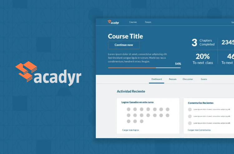
UI design
With a design system, it was easier to start designing. Next, I created the 4 step process needed to test with real users. The color was important in this step, so I added an ocean blue color on the header to help users identify their progress or essential information in the course.
Used tool: Adobe XD

User testings
The goal was to define the issues that users were experiencing with the MPV. We set up the prototype so that users could follow the path to the last screen in the flow (the lesson), but we also linked to other screens to click if they wanted. To accomplish this, we recruit ten users to make tests using MarvelApps as a prototyping tool.
These were our findings:
- The first registered users felt strange to see an empty board when starting the course.
- Users needed more space in the lessons, being able to hide the navigation.
- The CTA of the course page had to be more concise because reading the button, they thought that registration wasn’t free or didn’t have a clear idea about buying it. So we had to change the business logic a bit, proposing a trial period.
- Users were clicking on the reviews as if the stars were clickable. We understood that they needed to know precisely what other students had said, their rating, and the number of reviews the course had; these features can be translated into more confidence when purchasing the program.
- A progress bar was necessary within the lesson to encourage people to continue in the course.
- Having information and video on the same page was overwhelming for users, so videos and lessons had to be separated. Also, this could give users a greater sense of learning and progress throughout the course.
Learnings
I was the only UX designer in charge of this project. From the brand definition to the UX design process. I built a web platform that would serve as a virtual environment for students to assimilate complex concepts.
During creation, I had some stumbles, but I also managed to generate value. Here are some lessons I learned.
- Innovation: Understanding how other people approach the same problem taught me that sometimes it is better to improve an existing design than starting from scratch.
- We have little time to finish this MVP; This helped me gather even more frustrations than usual and turn them into new functionalities in future iterations.
Achievements
- End-to-end execution. We finished on time and tested our ability to design and develop a product as a team in a short time.
- Design process. The developers were able to start working from the beginning with just the initial idea. The design input at this stage is key to understanding the most important features they would need to get started.
- Design system. Implementing a design system in the first iterations can be very useful for agility in a product’s life cycle since it helps developers work quickly with the essential components and an established design guideline.